
A Big Dumb Chart to Explain the State of U.S. American SnoSport Skiing
Been just labouring away on this.

Hi. How was your Labor Day? Or “Labour” Day for my Canadian friends? I was in Canada last week. The persistence of this anachronistic spelling surprised me. Probably more than it should have. I know we are the weird ones, with our quarts and pet tigers and resurgent northbound Manifest Destiny. Slightly different spellings of a mutually observed holiday by neighboring (neighbouring?) countries commandeering the sacrifices of ancestors who picketed 107 weeks to demand a five-cent-per-day raise for work that put them at constant risk of decapitation by the chicken de-feathering machine so that we can go boating before the weather gets cold is not exactly a profound cultural differentiator. But last summer we went to Italy and the year before we were in Japan and the year before that we went to Spain/France/Portugal so I was trying extra hard to be abroad while traveling through what is essentially East Michigan.
OK I’m stalling. Because at some point I have to admit that I have not been working on any of the things that I said I’d be working on, like write-ups about the new Snow Triple Play and Indy Pass ski areas, or the eight recorded podcasts waiting for edit, or a comparison of various day-ticket products and buddy passes, or industrywide trends in lift ticket pricing. I mean I have sort of been working on them. But every sentence I write begs reference to a contextual dataset. For example: Snow Triple Play and Indy Pass added four and seven ski areas, respectively, in Quebec ahead of this winter. Straightforward enough, but framing this for my readers requires that I understand: how many ski areas in the province had already joined U.S.-based multimountain passes? How many in Canada? How many in eastern Canada? How many outside the U.S.? When did international membership begin and where? When did it accelerate? Only with this foundation can I build the House of Why – the real analysis that drives this newsletter. And as the sheer number of ski areas on U.S.-based passes multiplies, this base knowledge becomes both more crucial and more difficult to manage: including Indy’s 33 Alpine additions last month, U.S.-based multimountain passes have added 68 new ski areas this year, the majority of them outside of America.
Unfortunately, ski industry data in 2025 is where sports data was in 1995. I watched the Michigan-Oklahoma football game Saturday night. Announcers Kirk Herbstreit and Chris Fowler (man wasn’t it nice to have Michigan football back on ABC, even if just for a night?) casually threw out stats like: “Bryce Underwood is only the fourth true freshman quarterback to start his second game on the road at a non-conference night game against a Power Five opponent where his head coach played football for at least 16 months while also enrolled in two Thursday classes and the Platinum meal plan at Markley Hall.” Or whatever. Meanwhile anytime I try to look up “how many ski areas are there in Quebec?” I get 23.4 million answers, none of them numbers and half of them lists of The 10 Sickest Freedride Backflips Over Moving Vehicles by Bros Named Tucker.
Skiing deserves better. I’ve been building up reliable data on ski areas, operators, and ski passes for more than five years now. Too often, however, these have been one-off efforts, based on good information from a moment in time but obsolete once that moment flickered past. For example: how many of America’s ski areas have joined a national multimountain pass? What percent of the nation’s public ski areas with chairlifts have done so? How many have left such passes? Which ones, and when?
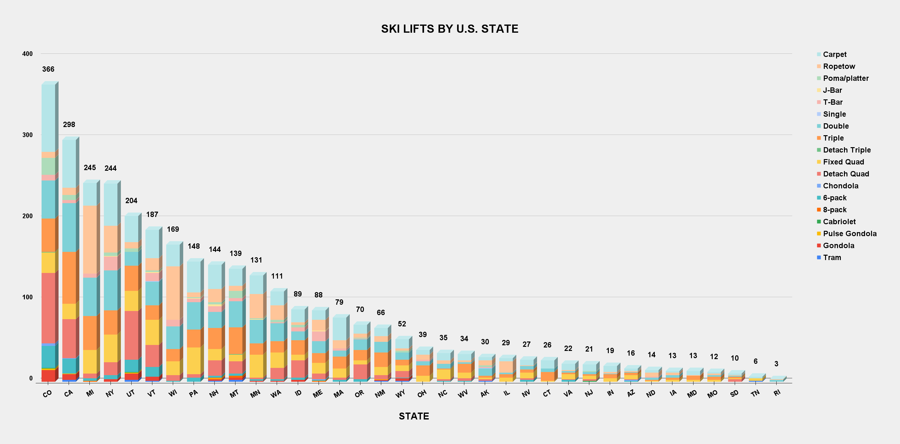
I’m tying all this together little by little. To stay relevant beyond the moment, there needs to be one source of truth that, when updated, updates all of these subordinate statistics automatically. I had a big breakthrough last year with pivot tables, and I’ve spent the past 10 days or so similarly syncing the U.S. American SnoSport Skiing Masterchart to summary pages that had formerly existed as manually tabulated one-offs. The result is this Big Dumb Chart that provides a real-time snapshot of U.S. resort profiles, along with the international scope of U.S. ski area operator ownership and U.S.-based multimountain pass penetration. This is gonna look like shit on your Pet Rectangle so just go find a computer:

This is actually just a snapshot of a far Bigger and far Dumber chart. Here’s a version that includes breakdowns for every U.S. state:

And here’s a version focused on international scope:

This is one of two new major summary charts, built using reference formulas pointing to THE MASTERSHEET. The other is a reboot of the multimountain pass tracker, expanded to include local multimountain passes, state kids passport programs, gold passes, and anything else I could find that provide access to more than one ski area. The chart is not being very photogenic right now, but you can view it here.
I know half of you are like “Wow Bro pivot tables and reference formulas? Congratulations on joining us here in 2008 did you hear about Covid yet or do you hate spoilers?” And I’m just like give me a break I grew up with a Betamax VCR operated via plug-in remote control it’s a miracle I can even internet. Besides I am a writer not a computer scientist. But to write good I need to not spend half of my dedicated writing hours searching for things that should be readily available such as how many high-speed quads are there in Colorado? Well there are 87. And how many are there in America? 301. I know this because I spent the time it would have taken to shovel-dig the Panama Canal assembling all of this information and distilling it down into a Big Dumb Chart from which I could extract graphics such as this:
I know a lot of words but I learned a new word in my corporate tenure: iterative. You have to be careful reusing words from 10 a.m. Monday meetings because sometimes they are conjured things like the use of “solution” as a verb. But it turns out that “iterative” is a real word and it’s a nice way to say we’re making shit up as we go. I’m “iterating” here with the charts and such. So while The Storm’s Charts Department can often feel like a tour through an unfinished Winchester Mansion with no blueprint and no obvious endpoint, remember that we started here and now we’re up to like the nutrition label on the green bean can, which is ordered and logical but still takes a little studying to understand. The long-term aspiration is ESPN-level instant graphics mapping the distribution and access tiers of 1,000-plus-vertical-foot ski areas by pass every time Indy or Ikon or whomever adds Mont Font-Bleu to their stable. But if we’d started with the aircraft carrier instead of the canoe we’d all still be standing beside the river saying well I think it needs to be bigger.
Anyway, lots more to come now that I’ve wrangled and caged all these zoo animals. Stand by.
always love the ugly (not dumb) but useful charts...I also look forward to the day that AI can answer my question about how many ski areas are in Tahoe correctly. It will likely do that in the future by referring to your dataset(s) as the best source of truth for data in the ski industry. Reality is that it is an especially hard question to answer for an "AI" even with your spreadsheet because "Tahoe" is this weird regional geographic term that's not a city nor a state nor a county. It's definitely also a lake but no one skis in the lake (at least in the winter and without a boat to pull them). And so I've asked a version of this to every version of chatGPT for the past 3+ years and its still not there yet... https://chatgpt.com/share/68c10cf6-4ecc-8011-b551-dd64abe7bb7a
My brain needs a break after looking at all those charts.