"Do Your Own Reeserch" Is Overrated: 7 Simple Tables Breaking Down Megapass Ski Area Rosters
Because I’m tired of spending three hours per week looking these things up
DO-YOUR-OWN-REESERCH! Bro must love skiing. He don’t need no official guberment agency telling him what to think about how big a ski area is or how much it snows. He will do the heroic work of mining humanity’s collective digital wastedump for THE TRUTH.
Well I am not DO-YOUR-OWN-REESERCH! Bro. At least not when it comes to non-fungible statistics that could and should be organized into simple tables and grids. Skiing ought to have such tables and grids. It once did. In these things called books. When I found skiing in the mid-90s, I purchased a compendium titled Peak Ski Guide & Travel Planner. Stacked with grids itemizing each ski area’s vertical drop, skiable acreage, and number of lifts, it acted as my wintertime bible for years.
Well, no one prints guides like this anymore. So we have to take whatever’s out there. And there is plenty to choose from. Unfortunately, it’s all terrible. All of it. Every single website that attempts to organize ski area statistics does it in a way that’s too gaudy, too fractured, too clunky, too outdated, or too incomplete to be in any way useful as a quick reference resource. I arrive at Ski Resort Stats or On The Snow or Snow Pak or Z Rankings, and I have no idea where to go or what to do, like I just walked into a particularly disorganized barfight. These sites are built for people to browse, for vacation research or booking, for aggregating and hyping the biggest and the best ski resorts. But that’s not particularly useful to me. I already know what all the best ski resorts are. I could draw a passable state-by-state map of them from memory. Here, rather, is what I want and need: a list of ski areas, sorted by state, and in alphabetical order from there, tabled alongside their major statistics.
Such a document is more difficult to find than you may suppose. Wikipedia has a crowd-sourced list, but it’s incomplete, and the top row - with the category names - isn’t sticky, so 300 rows down you’re just staring at columns of numbers marching across the screen with no context. The NSAA counts ski areas, but they’ve so far declined my requests to make this list public (the organization does publish this list of ski areas by year founded, but it’s missing dozens, including some obvious ones like Wolf Creek). While ski areas themselves do an OK job laying out their stats, they are only concerned with one mountain, and roughly 30 percent of ski areas don’t even bother with that.
You may suppose that the multi-mountain pass sites have a vested interest in itemizing the properties skiable on their product. But not a single one of them – Epic, Ikon, Indy, Mountain Collective, Freedom Pass, or Powder Alliance – includes a simple table on their website laying out each of their ski area’s major statistics. At times, simple numbers are nearly impossible to find: Vail insists, for example, upon lumping statistics for Boston Mills and Brandywine together. But these are in fact two distinct ski areas, each with a different vertical drop, set of lifts, and skiable acreage. I had to check a half dozen sites before I found one that broke the ski areas down individually (I finally located them on midwestskiers.com).
Some of the sites have maps. Some don’t. Some of the maps (Ikon especially) are terrific. Some, like Powder Alliance’s, are elaborate but pointless (you have to click through to view any stats). Some passes organize their ski areas by state. Others in alphabetical order, as though they were building a dictionary rather than tending to a geography-based ecosystem of related ski areas.
This is all so annoying. The fact that there is not a single source of truth for ski area statistics baffles me. I waste several hours per week hunting down the vertical drops of Winter Park or Snowbasin or Song Mountain, New York. I know them all, approximately, but it’s important to get these things right, to fact check myself. The search for truth relies on a capable foundation.
If the ski industry has not yet created this, they never will. Only one corner of the lift-served statistical universe has been tamed, and that is the world of chairlifts. This is the work of a single man: Peter Landsman, who has documented every chairlift, T-bar, gondola, and tram in the United States on his phenomenal Lift Blog. The site’s database is comprehensive, organized, and simple, striking that exact balance of minimalist and comprehensive. Each state has a page. All of that state’s ski areas are listed in alphabetical order on that page. Each ski area’s page lists all of its lifts (except carpets and ropetows), and basic statistics – lift capacity, year of installation, manufacturer, vertical rise, length, etc. A photo gallery of each lift is available upon clicking it. Landsman is a completist: the site is an inventory, not an awards show. And it’s wonderful, an indispensable research tool for The Storm. I visit it more than any other site, including my own.
I need the same sort of matter-of-fact database documenting ski area measurements: a simple list, organized by state, itemizing each ski area’s vertical drop, base and summit elevation, skiable acreage, and average annual snowfall. It could also include an itemization of lifts by type (including carpets and tows). Trail count is largely a vanity project, particularly in the Midwest, but it’s a nominally interesting at-a-glance statistic.
Since I have been searching for this for years and have found myself increasingly unhappy with available online resources, I am just going to build it myself. This is going to take a while. But after growing frustrated while working on a Vail Resorts story yesterday because making a simple comparison would have required clicking through 35 different webpages to verify the numbers I had to verify, I set that aside and decided it was time to get started.
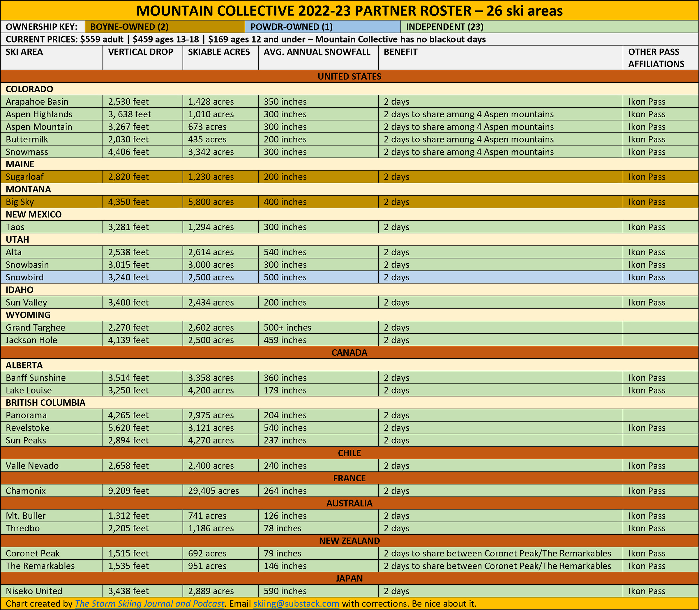
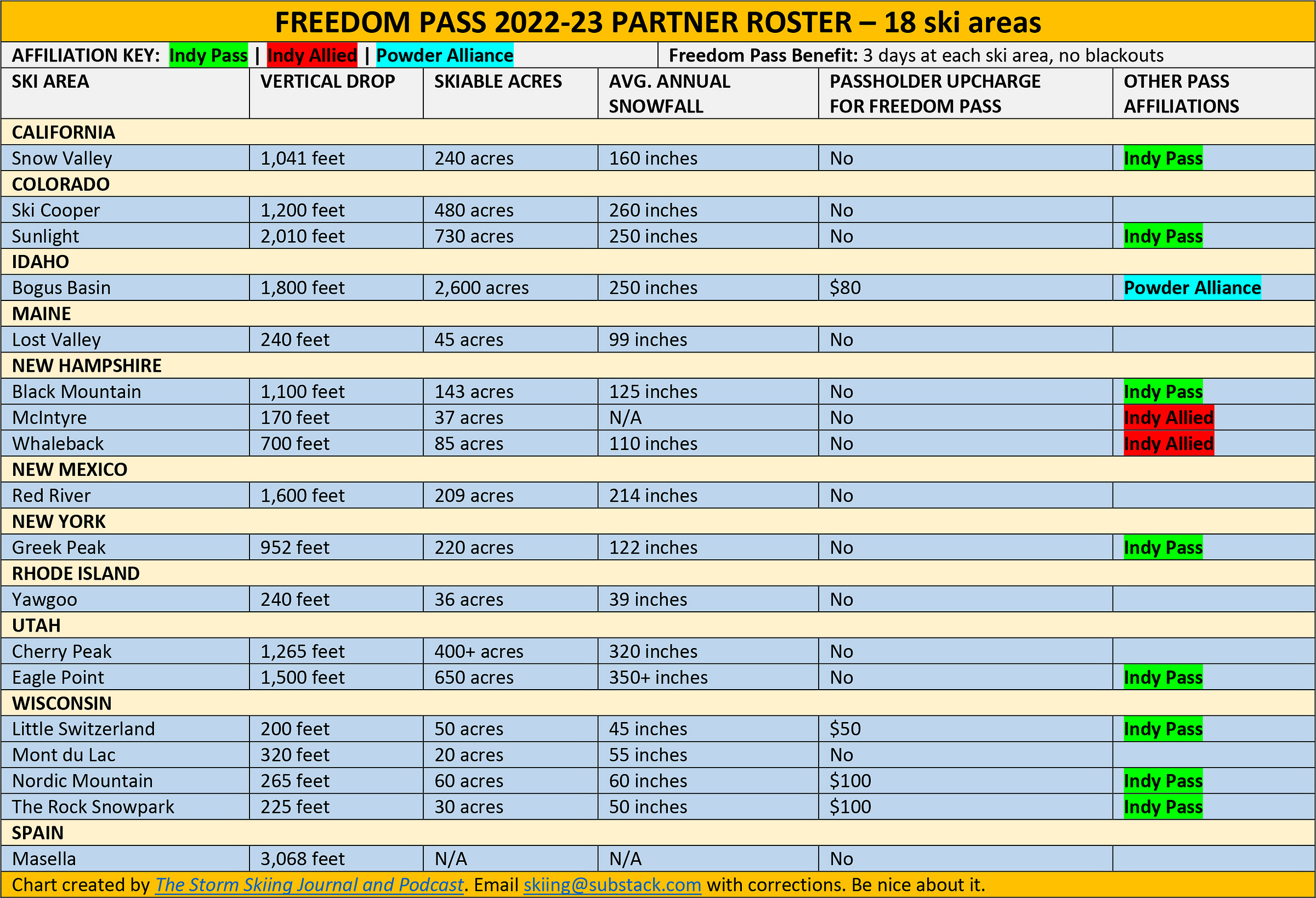
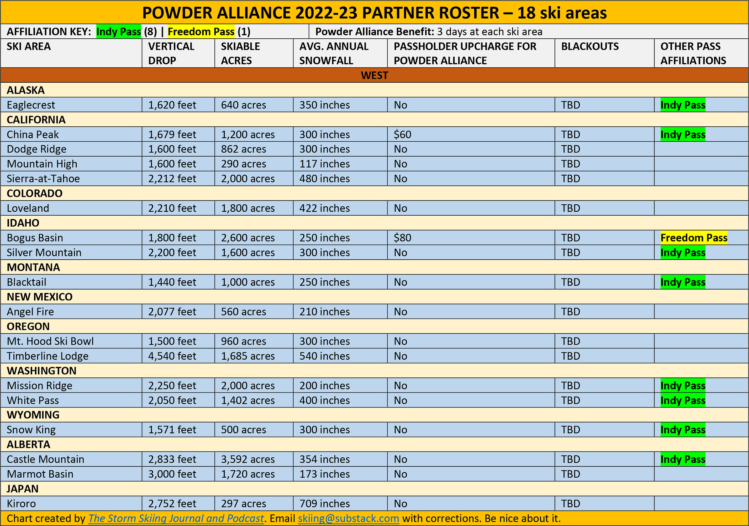
So I began with the numbers I go hunting for most often: those of the ski areas associated with the major multi-mountain passes. I created simple charts organizing every ski area on the Epic, Ikon, Indy, and Mountain Collective passes by region and state. I tracked down the vertical drop, skiable acreage, and average annual snowfall for each, and added some information around pass price and affiliation, as well as blackouts and basic access tiers. I built similar charts for the Freedom Pass and Powder Alliance coalitions, as well as Ski Cooper’s 60-mountain reciprocal pass coalition. You can view them by clicking through below (I’ve also pasted them at the bottom of this article - scroll way down):
EPIC | IKON | INDY | MOUNTAIN COLLECTIVE | FREEDOM | POWDER ALLIANCE | SKI COOPER
This is step one. Over the summer, I’m going to aggregate all of these onto one larger chart, add the rest of America’s ski areas, track down their base and summit elevations, and publish the whole thing online (I’ll link to it from stormskiing.com). I’ll hopefully add lift and trail counts over time. I also plan to build out additional fact sheets and resources, including, possibly, a timeline of the multi-mountain ski pass; an online map of U.S. ski areas; some sort of simple distance table that shortcuts Google Maps; and a seamless way to view current, static trailmaps that shortcuts those stupid interactive maps that are increasingly ubiquitous. I’ll also continue to update the Pass Tracker 5001 and the reciprocal pass chart, and think about ways to knot all of these resources together into a logical ecosystem.
This is going to take some time, but it will end up saving me countless hours down the road. Here’s a brief Q&A to orient you to this initial batch of charts, and where I hope to take this thing over the next several months.
Where did you get all these measurements from?
Whenever possible, I used a ski area’s own website. In those cases, the numbers are as reliable as the ski areas are honest. At some point, I will address the notion of measurement consistency across mountains. Right now, Middlebury Snow Bowl is saying it’s bigger than Sugarbush, which is just dumb. But I don’t have time for that fight right now, so I’m using what’s out there. Where an individual ski area has neglected to inventory their own existence, I’ve relied on a variety of outside sources, most of which are mentioned above.
If you’re so obsessed with completeness, why did you publish these sub-charts first, rather than a full inventory of U.S. American ski areas?
These lists are going to capture 95 percent of the ski areas that most skiers care about. It’s season pass season (though most of the best deals are already gone), so this is when people need to really get their heads right around the sort of access that each pass delivers. I’d already created these charts for Indy and Cooper, so I figured I’d just inventory the rest of the big passes and get something out there. Plus, like I said, I needed the Vail chart for a story I’m working on.
Why are the stats different for some international destinations?
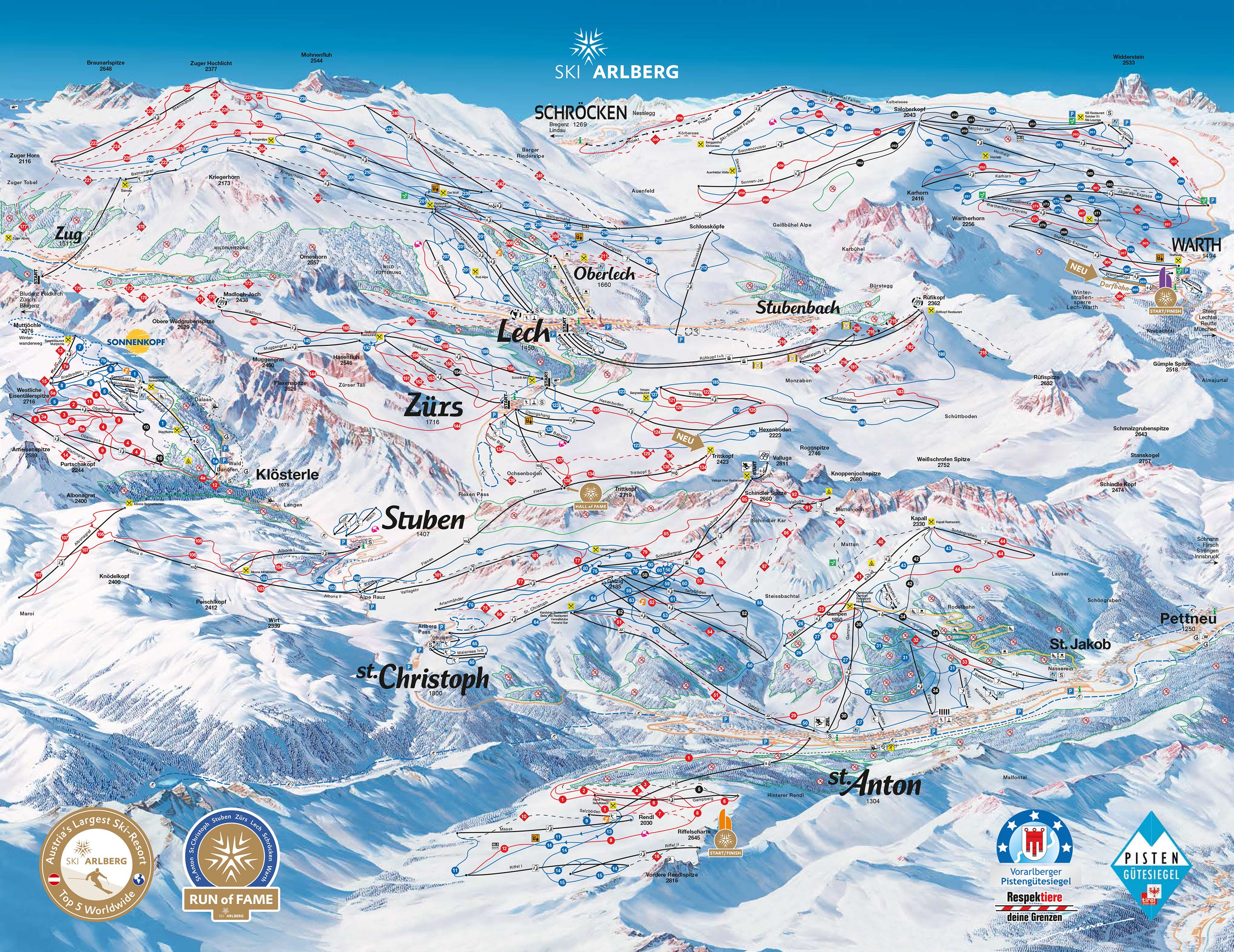
Click into the world of international ski area statistics, and things get weird fast. It’s like they’re written by a Martian trying to reformulate concepts across cultures: snowguns become “snow cannons”; runs become “courses”; double chairs are “pair lifts.” Entire categories of statistics are often absent: Europe and Japan care more about average snow depth than average annual snowfall, a stat that’s nearly impossible to find outside of the English-speaking world. Euros tend to quantify ski area size by kilometers of trails, rather than total skiable acreage, a habit that’s a bit odd considering the general lack of trees at the continent’s ski centers. It can also be difficult, in Europe, to determine what a ski area even is. Arlberg, Austria, for example, is listed as a destination on the Epic Pass. But this is not just one super big ski area. It’s five super big ski areas combined into a single destination. Examining the trailmap, it’s impossible to see where one ends and another begins.
Finding statistics for each distinct ski area is basically impossible. I ran in Chrome circles for an hour trying to break out the five area’s individual stats before giving up and just reverting to Arlberg’s combined statistics. It is unlikely that I will ever attempt the insane project of logging all of the world’s ski areas – I am only including the non-North American resorts that are part of U.S.-based passes, and that will likely remain true for all international destinations aside from Canadia.
When are you going to inventory Canadia?
One thing at a time. But I will do it at some point.
Why are the regions different on each chart?
For each pass’ chart, I mimic the regional designations that the coalition makes on their own websites. Ikon has a Pacific Northwest category, for example, but Epic does not, and my charts reflect that distinction. For the coalitions that have not created regional subgroups, I organized the ski areas by state, in alphabetical order. The U.S. is first, and other nations follow below.
Why do you only include adult price tiers on the charts?
For now, The Storm remains a one-man operation. I need to keep these charts as simple as possible. The adult, no-blackout pass is a good baseline because it is the only pass tier that is universal. Until I figure out a way to feed this information directly from websites (which, frankly, will probably never happen), this one number is going to have to serve as the tell for associated price tiers.
Why do you count Snow Summit and Silver Creek as separate ski areas, rather than as part of Big Bear and Snowshoe (which they are)?
I realize this is confusing. But both of these are separate ski areas with their own distinct vertical drops, lift fleets, acreage and trail counts. Alterra actually sells a separate Silver Creek season pass (access to Silver Creek is also included on the Snowshoe season pass, as well as every Ikon Pass product). Big Bear and Snow Summit are two miles apart and not interconnected. The same basic reasoning applies to Jack Frost and Big Boulder and Boston Mills and Brandywine. I find these combinations annoying, frankly. Particularly on the Ikon website, where the insistence on grouping mountains as “destinations” obscures the nuances of, say, Aspen’s four mountains, or the vast differences and distinct character of Banff Sunshine, Lake Louise, and Mt. Norquay, which are collectively known as Ski Big 3 – a name so vague as to basically be meaningless.
The one reverse exception that probably seems puzzling is Palisades Tahoe, which I treat as a single resort, rather than as Alpine Meadows and the Olympic side (formerly Squaw Valley). That’s because these two will soon be connected via a $12 zillion gondola, just as Canyons and Park City and Whistler and Blackcomb are now stitched together.
You already made a pass tracker and a reciprocal pass tracker. Why do you keep organizing the same information in different ways and pretending like it’s a big deal?
Because the more information I organize, the more I realize what’s missing. Could I have simply combined the different elements of the Pass Tracker 5001, the reciprocal grid, and these documents into one super doc? Probably. But each is useful for a different reason. I imagine I will be combine and retire some of these documents over time. Consider this The Storm’s youthful experimental phase. Hopefully at some point I’ll just have everything organized the way I want it and can just maintain these things rather than investing sums of time that would have been sufficient to earn a doctorate in single-sub-celled space biology.
These look pretty basic. Can I help make them look better?
Basic is the point. I am very much a function-over-form kind of person. I just need the information to be accurate, presented in a clean and consistent way, and easy to access with a single click. These are personal reference documents that I’m making public because someone may find them useful. The problem with all of the sites that I point to above is that they are too overdone, too complicated, too focused on organizing a seminar that should have been an email. The reason I chose Substack as the platform upon which to build The Storm is that it requires exactly zero thinking about technology or aesthetics so that writers can focus on writing. That’s literally the point of the entire enterprise. And since writing is the only thing that I care about, it’s a perfect match. But another thing that gets in the way of writing is stopping every three minutes to look up some unchangeable statistic. These documents are meant to solve that problem and only that problem. If you want to play dress-up with them, be my guest, but don’t ask me to spend any time helping. None of this information is invented or proprietary – I’m just assembling pre-existing information and putting it somewhere where it’s easy to find, so have at it.
Is it that hard to just look things up?
Ninety percent of the time, no. But it still takes several clicks to, say, find the average annual snowfall of the average ski area. Many of them, like Stowe or Telluride or Park City, get caught in the Google mesh with their eponymous towns, complicating search results. Finding the skiable acreage of an off-the-grid hill like Ski Sawmill can eat up 10 or 15 minutes. And when you’re pushing out 100 articles per year about lift-served skiing, as I’m doing with The Storm, that time adds up.
Really though why are you doing this? Is there something wrong with you?
Maybe. But there is a point. I’ve had a working knowledge of U.S. America’s lift-served skiing landscape for more than 25 years, but since launching The Storm, I’ve realized how much I still don’t know.
In 2014, The New York Times published a feature on The Knowledge, “London’s legendary taxi-driver test,” which they framed this way:
The examination to become a London cabby is possibly the most difficult test in the world — demanding years of study to memorize the labyrinthine city’s 25,000 streets and any business or landmark on them. As GPS and Uber imperil this tradition, is there an argument for learning as an end in itself?
This is the level of mastery I’m going for around the world of U.S. American lift-served skiing. Why? Because I want to deliver an excellent product – particularly now that The Storm has earned a large, and growing, paying constituency. Most ski media – what is left of them – focus on the three or four dozen largest ski areas in the country. My self-assigned beat is all of them. And as more people trust me to talk about this idiosyncratic world, I need to know what I’m talking about, and in a spectacularly intimate way. Creating these charts helps me do that.
Why do you call it “U.S. America?”
Because I’m a proud U.S. American.
But that’s not the name of the country.
Says who?
Um, everyone.
Look, if you’re not comfortable carrying your patriotism around on a banner, I get it. It’s a heavy obligation. Not everyone can handle it.
But what I’m saying is…
It’s a shame, really. But I’ll just carry it for you.
You’re impossible.
That’s probably true.
So where are these stupid charts?
Right here:
The Storm publishes year-round, and guarantees 100 articles per year. This is article 55/100 in 2022, and number 301 since launching on Oct. 13, 2019. Want to send feedback? Reply to this email and I will answer (unless you sound insane). You can also email skiing@substack.com.






i am now a “US America” convert. 🇺🇸
I've said this before, but you're a total madman Stuart! These charts on The Storm, whether it's these or the Pass Tracker 5000 are probably the best charts I've seen pretty much anywhere on the interwebs!