
Build Your Own Big Dumb Ski Charts
While Supplies Last

There are many problems with my Big Dumb Ski Charts but one of the Biggest and Dumbest is how gigantic the whole ecosystem became once I figured out the fourth-grade concept of pivot tables. Yes I could spin off tables itemizing all 233 Indy Pass ski areas or all 11 ski areas owned by Boyne Resorts and the numbers would update whenever I altered a value in the Big Dumb Mastersheet. But these were still effectively static tables, meaning I couldn’t easily reconfigure them to, for example, order all 42 Vail Resorts by vertical drop or year of acquisition. So tabs multiplied across the main Google Sheet to accommodate these different versions of everything, which in turn slowed the Google Sheet, which in turn distracted from writing because every time I went to reference some Dumb statistic, I had to deal with Google’s pivot table editor, which would lose a footrace to Pangea.
The Dumber part is that I knew what I needed: some sort of live table that users could easily sort with header clicks and checkboxes. While I understood that this technology was so simple that it predated the invention of the wheel by several centuries, I could not figure out how to create such a thing. Whenever I’d Google “make a checkbox site” I would get 10,000 results for platforms named RegynRXX or something equally stupid that would either drop me onto an unusable blank workspace or ask 412 questions so they could assess my enterprise needs and assemble a quote. And I’m like “Dear God I just want a version of the checkbox-thingy that I used on cars.com in like 2003.”
So finally I just asked the robots “hey Robot how do I do this?” And Robot said “here are like five ways.” And I picked a free one called Google Data Studio that plugs into my Google Sheet. It was still stupidly over-complicated, but after a day of fighting my way uphill and to my credit not smashing my laptop into the pavement I came up with this thing:
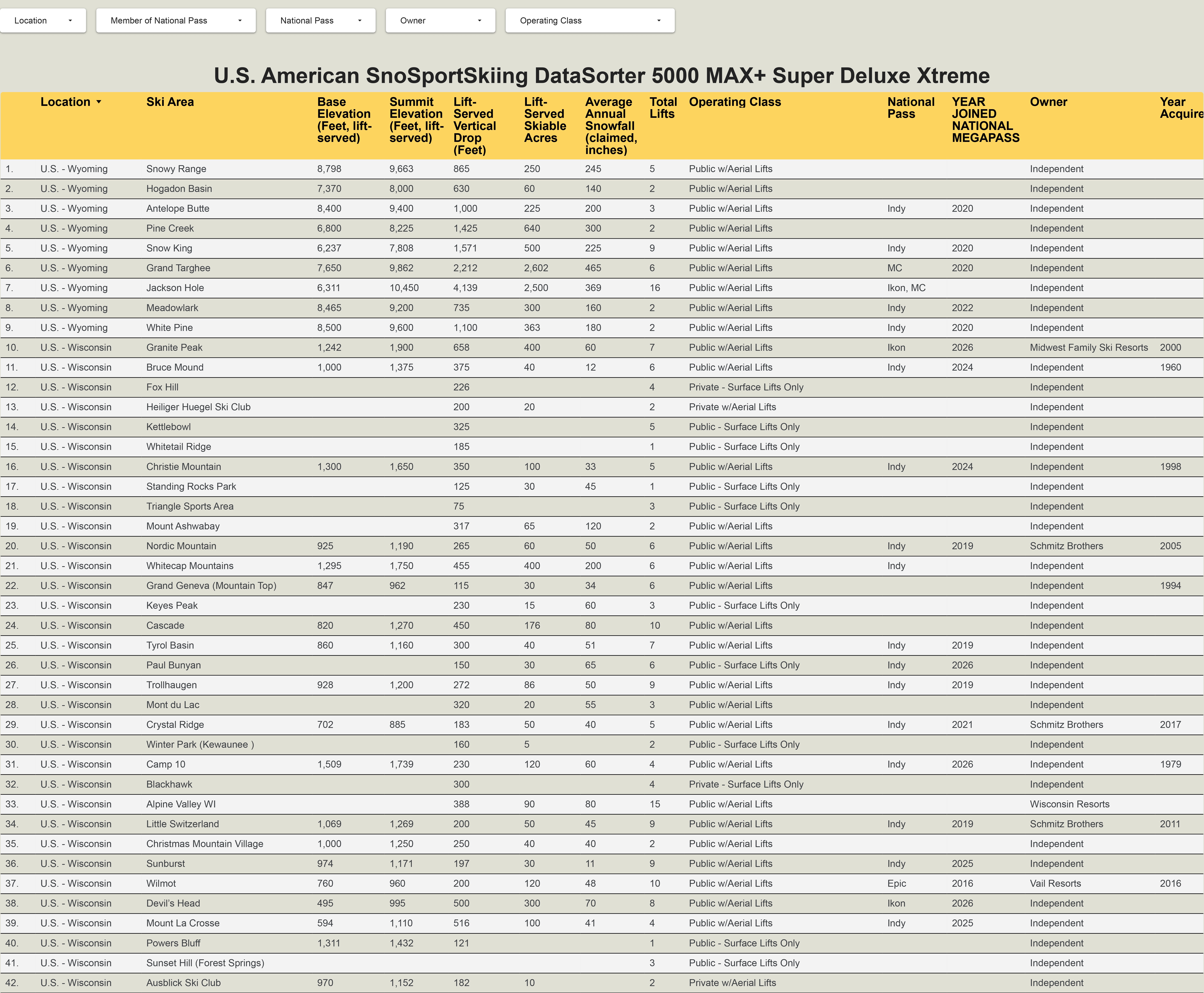
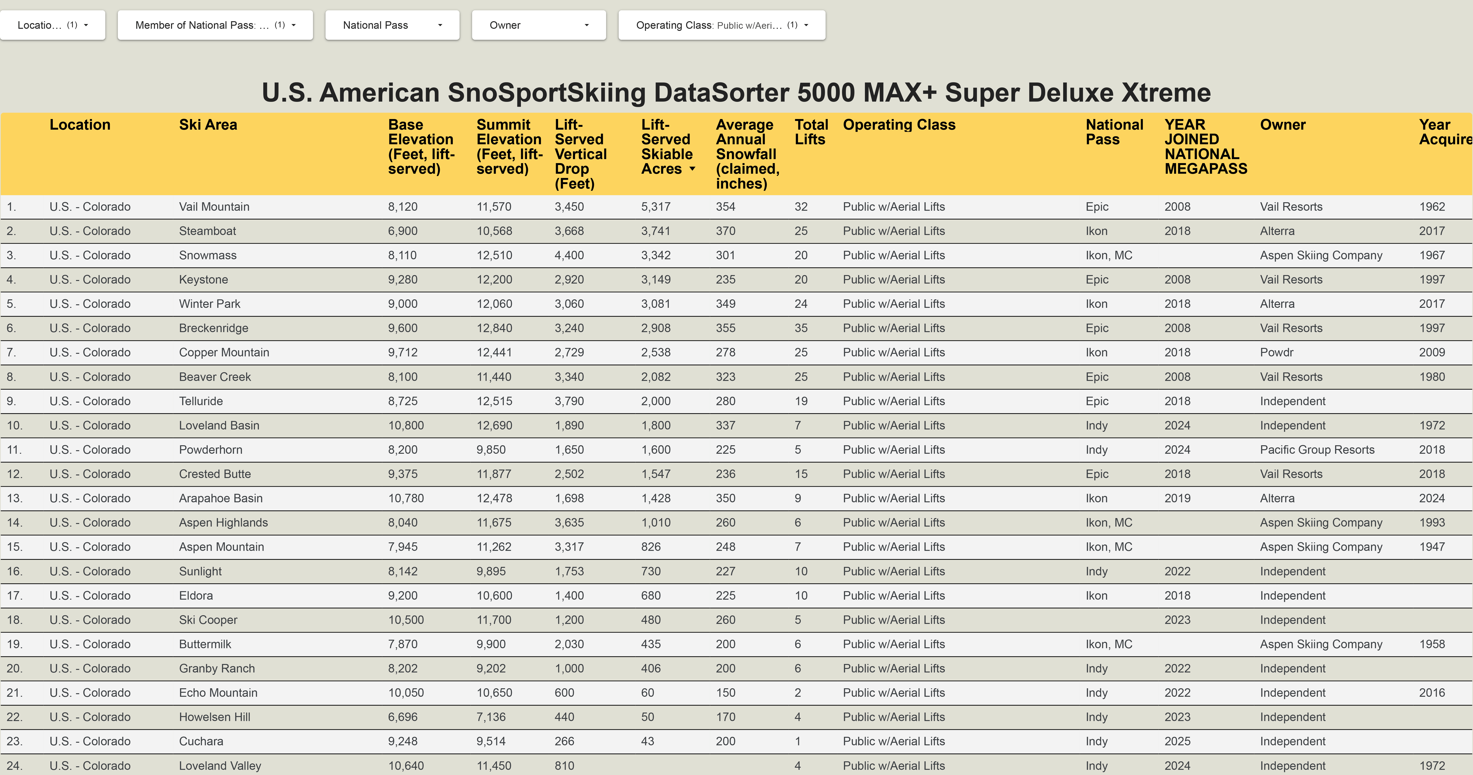
And you’re like so what that looks even worse than your normal Stupid Charts. And I’m like stay with me here Tiger this is actually pretty cool. Because on the Google Data Studio page (not the image above, which is just a screenshot), any user can click into any category – base elevation, average annual snowfall – and order the resorts from highest to lowest or lowest to highest. Then, using the drop-down menus at the top, they can sort by any combination of five categories, including location, pass affiliation, owner, and operating class (meaning public or private, aerial lifts or surface lifts only). So if I want a list of all the ski areas in Colorado that spin chairlifts and participate in a national ski pass, and I want them ordered from largest to smallest, I do all the proper sorting and come up with this:
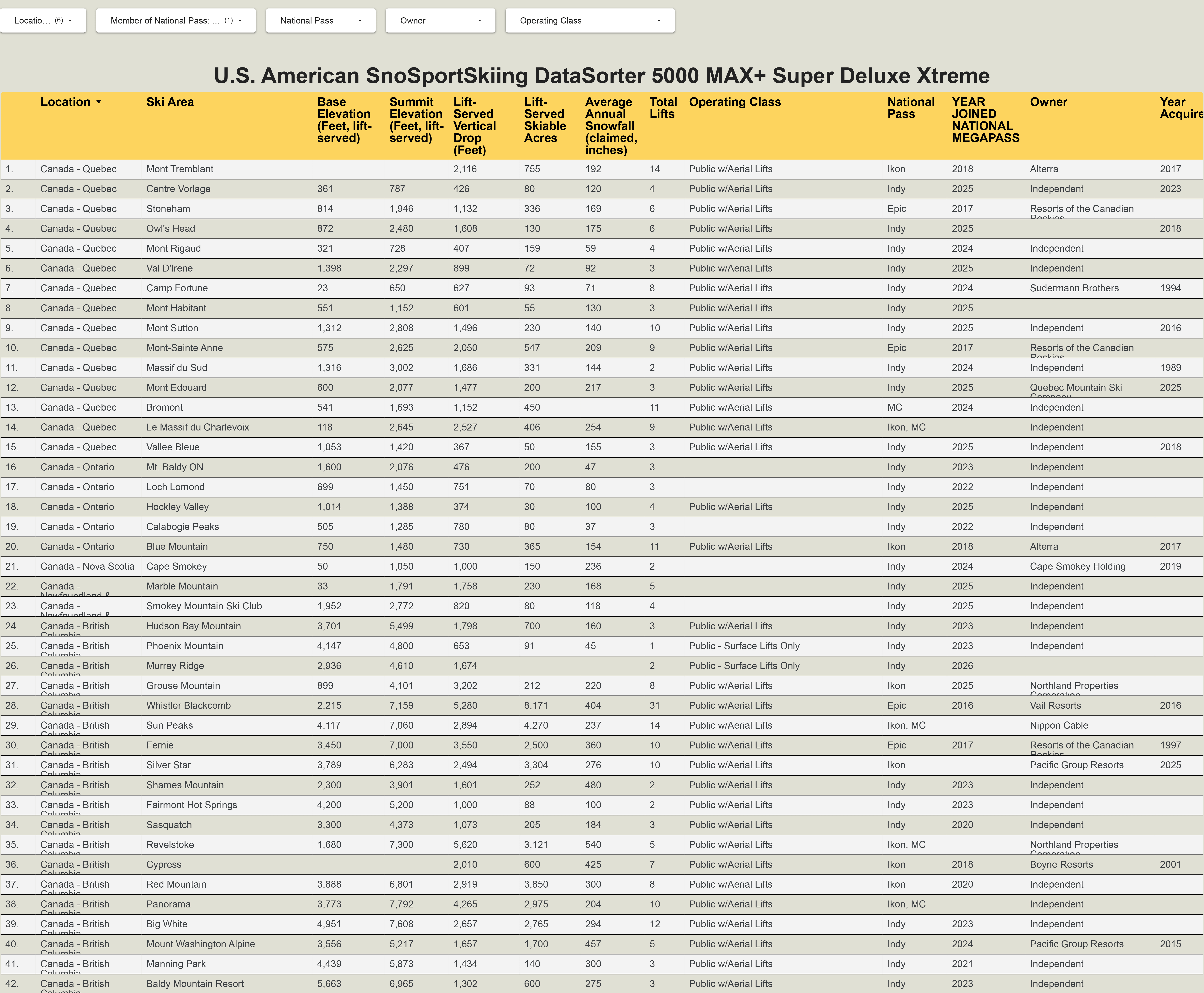
Or lets say I want a list of every ski area in Canada that has joined Indy, Epic, Ikon, or Mountain Collective, organized by province:
And if you don’t think that’s the greatest thing ever, you’re probably right. For now, this chart only includes 658 ski areas: all active ski areas in the United States, and any ski area anywhere in the world that participates in the Epic, Ikon, Indy, or Mountain Collective passes. And for now, I’ve only included 13 basic categories (vert, acreage, pass, etc.), rather than the hundreds that are catalogued on the Big Dumb Mastersheet. And even those 13 categories aren’t complete, as I’ve not yet subjected myself to the ordeal of determining, for example, the base elevation of Fox Hill, a 226-vertical-foot, surface-lift-only bump in Wisconsin.
But this chart, rudimentary as it is, should ignite a whole new era at Storm HQ. Because once I figure out how to do a thing poorly, nothing can stop me from doing it slightly better the next time. And even if I never touch it again, at least this stupid sorty thing finally exists.